All About Graphics Design
All About Graphics Design URL: https://impactsocialmedia.net/advertising-graphics/all-about-graphics-design-elements-and-methodology/
Description: Graphics design is a collaborative effort between a client and artist. The goal is to produce a finished product that will effectively communicate a specific message to the intended target audience. This requires productive collaboration and effective utilization of the various design fundamentals. In order to give you a deeper understanding of the process and our methodology we would like to take some time to briefly discuss a few key elements, concepts and processes.
I. Design Elements and Concepts
1. Layout
When we refer to layout in graphics design, we are talking about the manner in which we manage space and form. This essentially means arranging the various elements in a way that allows the reader to absorb them with minimal effort. When the layout is properly done maximum visual impact is achieved and the reader can easily navigate the various elements of the design.
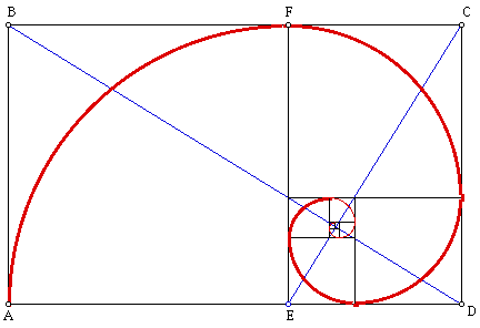
Through careful balance the juxtaposition, pace, hierarchy, active elements, passive elements and perimeter can be used to design a layout that falls within the Golden Section. The Golden Section is a proportionate ratio of 8:13 and results in a design that makes use of the Fibonacci Numbers. This results in a harmonious and natural design that is very balanced and pleasing to the eye.
2. Typography
When we refer to typography we mean the visible form of a written communication. When reading communications, the eye receives the visual form and the mind converts that visual form into meaningful letters, words and sentences. Typography is an essential element of graphics design and much consideration should be given to it in order to achieve maximum impact.
The typeface, size, color and spacing are all typography sub-elements that are combined to create the entire typography element. These sub-elements can be leveraged to give the written communication more than just letters, words and sentences. By this we mean the “look and feel” and/or “emotional and psychological” effect of the typography as the reader views it.
For instance, the color pink can be used to convey femininity while purple can allude to royalty while blue may be used to send a signal of trust or black to show dominance. In likewise fashion, typeface can also convey emotion and presence. To illustrate this point further consider the following examples:

3. Line
A line can be considered as a simple or basic element of graphics design and yet it can have a profound impact on the entire design. Line can be used to divide the space and it can also be used to direct and guide the viewer’s motion. Line can also be used for emphasis in the form of an outline of a shape or by using line to form types of shading and texture. A line can be used in harmony or contrast to other design elements.
Delicate organic lines can be used to display beauty and elegance while bold and thicker lines can be used to convey a more mechanical feel. Vertical lines can be utilized to express stability. Horizontal lines can be used to give a feeling of serenity and calm. Diagonal and sloping lines tend to display a sense of being in motion or feeling of tension.
4. Shape
Shape is a design element that has height and width and is two-dimensional without depth or mass. By definition, shape lacks acute detail and therefore should be the first recognizable image within the design. When properly designed, the shape element(s) should draw attention from a distance while intriguing the viewer to move in closer for a more detailed view of the entire design.
Depending on the nature and objective of the graphics design, a variety of shapes may be used such as abstract, distorted, non-objective, realistic and stylized. Abstract shapes are those which have been minimalized or reduced to their simplest form. Distorted shapes are those which have been tweaked from the original form and yet can still be recognized as natural. Non-objective shapes are those which are unique and not related to any natural form. Realistic shapes are quickly seen as commonly known and naturally occurring items. Stylized shape is realistic with a slight abstraction added to it.
Effective graphics design will make use of the shape element to enhance and project the message of the entire piece. It is sometimes beneficial to make use of more than one type of shape. The chosen shape(s) can be in harmony or contrast with other design elements as needed.
5. Negative Space
Negative space can be thought of as the surrounding and empty area to a positive shape. Negative space is a powerful design element and can actually become as positive space depending on the design.
The purpose of negative space is to create more focus towards other important design elements. Negative space can also be used for emotional and psychological impact through the proper use of color and texture. Additionally, proper use of negative space prevents a design from being too busy or cluttered.
6. Volume
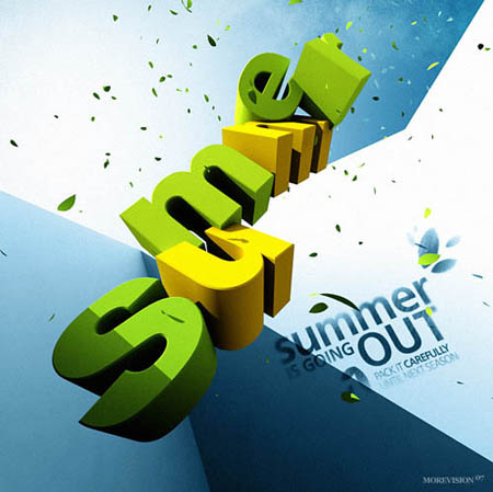
The volume design element is when three dimensional images are incorporated into the graphics design. These images can be enhanced by making creative use of the perspective viewpoint of the image. Volume gives depth and dimension to a graphic and can enhance the effectiveness of the overall design.
Volume can be used to create a very unique design by adding a greater sense of reality to the subject matter. Volume can also be used to create a depth perception within the design. Additionally, volume can be made to enhance the look and feel of the overall design by creating a sense of motion or range of time.
7. Value
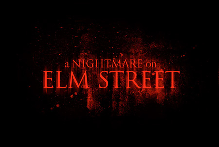
The value design element is the contrast and use of dark vs. light. When there is an extreme difference in contrast it tends to add depth and clarity to the design. When the difference in contrast is minor the design lends itself to subtlety.
A lighter value is called high key and a darker value is low key. Value has an impact on the emotional and psychological impact of the overall design. This is because a lighter value is perceived as being cheerful and happy whereas a darker value is perceived as being ominous or serious. Value contrast can also be emphasized where the value of the negative space plays with or against the positive forms to give even greater overall impact.
8. Color
Color is arguably the most complex of all of the design elements. The best way to understand color is to break it down from the twelve hue color wheel.
- Primary – Red, Yellow and Blue
- Secondary – Orange, Purple and Green
- Tertiary – Blue-Green, Yellow-Green, Yellow-Orange, Orange-Red, Red-Purple and Blue-Purple
Colors have a “value” that refers to the darkness or lightness of the color. When we darken the color we call that “shading” and when we lighten a color we call that “tinting.”
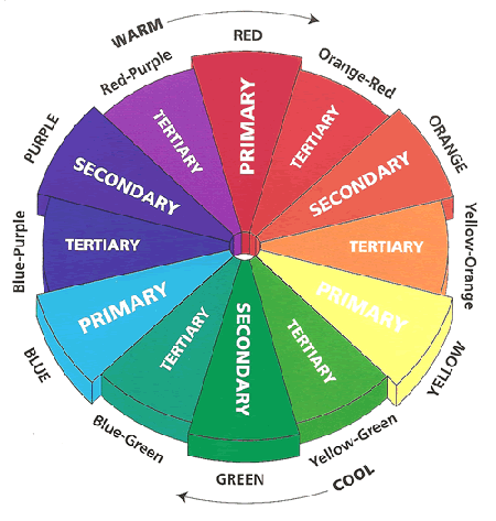
Colors that are across from each other on the color wheel are said to be “complimentary.” Colors can be altered in intensity by adding black, white or any complimentary color. From the color wheel above there are four different color schemes that can be used to create harmony and aesthetic combinations.
Color Schemes:
- Complimentary – Colors from opposites sides of the wheel
- Triadic – 3 colors that are equally distant on the wheel
- Monochromatic – 1 color with all of its tones and shades
- Analogous – A combination of adjacent colors on the wheel
Triadic and complimentary color schemes appear livelier whereas monochromatic and analogous are more relaxed. Color can be used to convey a feeling of warmth or coolness by using warm or cool colors. Yellow, orange and red are considered warm colors and blue, blue-violet and blue-green are considered cool colors.
Discordant colors are colors which have no color scheme relationship with one another. Discordant colors can be effectively used to create a dramatic effect or a sense of surprise.
So far, we have not even begun to scratch the surface of color in design. Let’s just finish up on these notes: Color preferences and color schemes can be subjective as they say, “beauty is in the eye of the beholder.” A professional graphics design cannot be put in a “box” or confined to any one best color or color scheme. Of more importance is that the entire design accomplishes the task at hand and that is to effectively communicate the desired message to the desired audience.
9. Texture
The texture element in graphics design is just as the name implies and it refers to the appearance of the surface. Texture can be further divided into two categories, implied and tactile.
Implied texture simply means that the appearance alludes to a surface texture although we cannot actually feel it with the sense of touch. A tactile texture means that the texture we see can actually be felt through the physical sense of touch. When dealing with graphics design the texture is the implied version but can have the same effects as the tactile version.
Texture can be used to give a sense of reality to the design. Some items can only be portrayed accurately and effectively if the original surface texture is depicted. Another use of texture is to create a certain type of look and feel such as very old or very wet.
II. Design Processes and Methodology
1. Interview
Impact Social Media begins the graphics design process with a thorough interview. During this interview we will be asking a lot of questions and doing a lot of intent listening. Our goal is to determine your needs, concerns and objectives. This is how we can best understand your business, products and services and of course your target audience. It is this in depth understanding that will give us a solid foundation and starting point to move forward with the process.
2. Research
The next step is lots and lots of research. We need to know the details of your target audience and competitors. This gives us a comprehensive overview of the demographics and challenges that must be addressed. During the research phase we may be in touch with you repeatedly for additional information.
3. Brain Storming
During step three we visualize everything we learned in the first two steps and contemplate a proper strategy. The strategy will define an approach that will effectively communicate a focused message to the target audience. During this phase we will collaborate with you for constructive feedback and ideas.
4. Conceptual Sketches
Step four involves creating the initial sketches of the potential graphics designs. During this step we will produce more than one design which will give us flexibility while simultaneously providing you with more options.
5. Sketch Collaboration
At step five we will meet with you to present the conceptual sketches for your viewing and feedback. Our goal is your satisfaction and so we will be focused on your comments, ideas and suggestions. This will fully equip us to move forward with the rough draft development. During this step we will settle on which design to utilize.
6. Rough Draft Development
Step six is when we evolve the sketches into a rough draft and this is based on your input from step five.
7. Rough Draft Collaboration
At step seven we will present to you the rough draft for a final analysis.
8. Final Design
Step eight involves creating the final graphics design based on your input from step seven.
9. Final Design Collaboration
At step nine we are near or at final completion. At this time we will submit the final design for your final approval. At this time you will determine if any final revisions are required.
10. Final Revisions
If step nine reveals the need for any last minute revisions, those will be completed during this step and you will then be provided with the finalized design.
If you are in need of professional graphics design we would be happy to earn your business. Impact Social Media will work closely with you to produce a finished design that will effectively reach your target audience with the intended message. We understand the elements of graphics design and we also understand the methodology of the entire process. Our goal is your satisfaction and our focus is your success.
If you are in need of professional graphic design services contact us today.
Download the information on this page in a Microsoft Word Document
Download the information on this page in an Adobe PDF PDF document
Download the Adobe Document Reader on this page PDF Reader
We offer professional and affordable graphics design with quick turn around times for the following:
- Advertising
- Backgrounds
- Banners
- Brochures
- Business Card
- Envelope
- Flyers
- Headers
- Icons
- Letterhead
- Marketing Materials
- Pushers
- Trade Show
- Vector Graphics
- Animated Logo
- Standard Logo
- Vector Logos

Comments
Pingback: Learn about graphics design | Impact Social Media
Pingback: All About Logos | Impact Social Media
Pingback: All about graphics design elements and methodol...